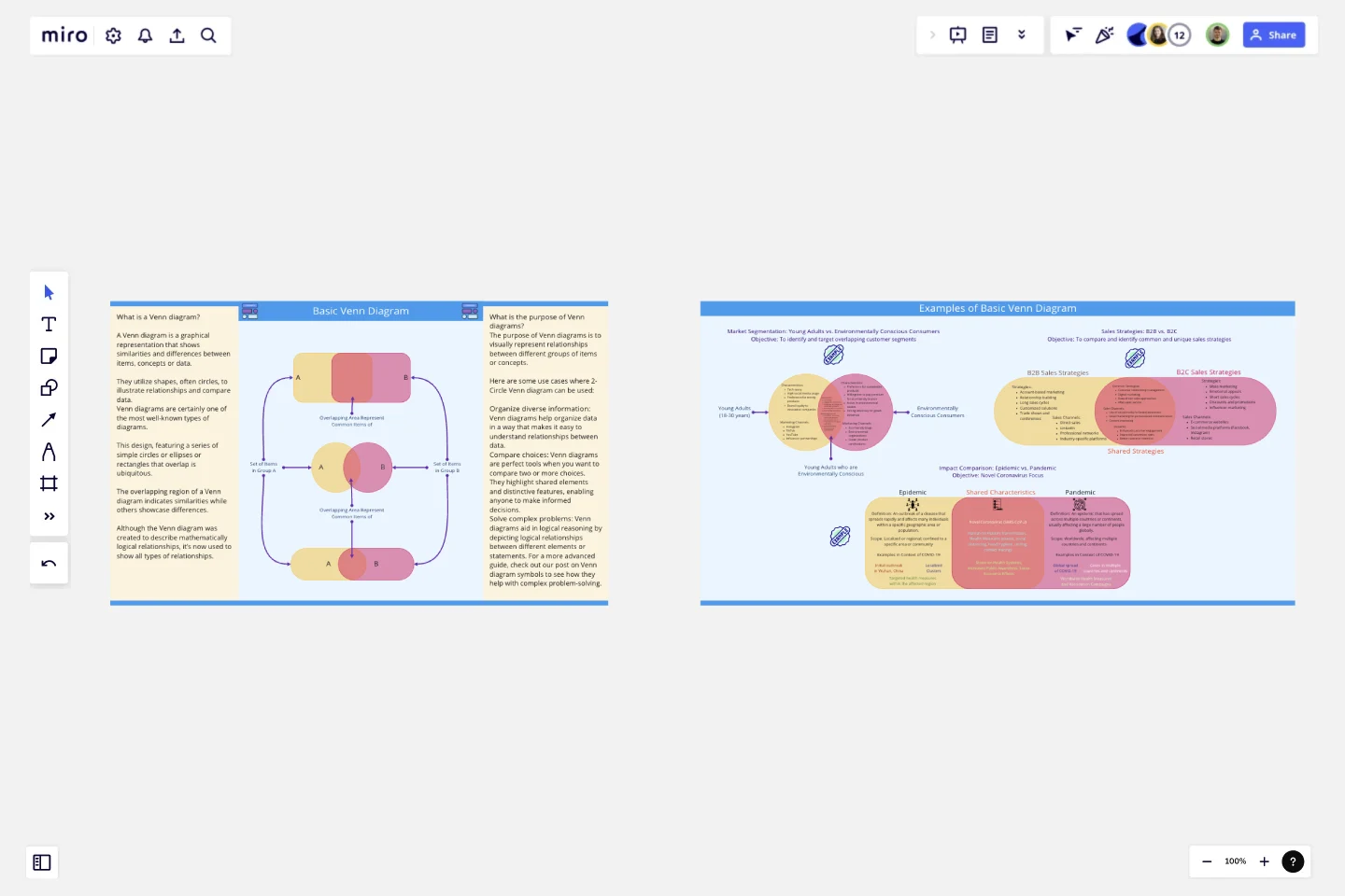
Basic Venn Diagram
A Venn diagram is a graphical representation that shows similarities and differences between items, concepts or data.
They utilize shapes, often circles, to illustrate relationships and compare data.
Venn diagrams are certainly one of the most well-known types of diagrams. This design, featuring a series of simple circles or ellipses or rectangles that overlap is ubiquitous. The overlapping region of a Venn diagram indicates similarities while others showcase differences.
Although the Venn diagram was created to describe mathematically logical relationships, it’s now used to show all types of relationships.
Purpose of Venn diagrams?
The purpose of Venn diagrams is to visually represent relationships between different groups of items or concepts.Here are some use cases where 2-Circle Venn diagram can be used:
Organize diverse information: Venn diagrams help organize data in a way that makes it easy to understand relationships between data.
Compare choices: Venn diagrams are perfect tools when you want to compare two or more choices. They highlight shared elements and distinctive features, enabling anyone to make informed decisions.
Solve complex problems: Venn diagrams aid in logical reasoning by depicting logical relationships between different elements or statements. For a more advanced guide, check out our post on Venn diagram symbols to see how they help with complex problem-solving.
Use this template to create basic level venn diagrams comprising two circles or any other shape. Three examples are also given in this template, which you can use or learn to create your venn-diagrams.
This template was created by Khawaja Rizwan.
Get started with this template right now.
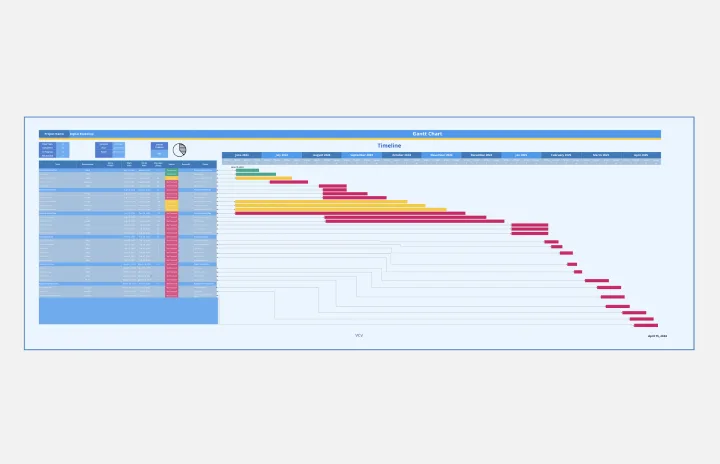
Gantt Chart Project
Works best for:
Strategy, Planning
The Gantt Chart Project template is a versatile tool for managing various types of projects. It provides a clear visual timeline of your project's tasks, deadlines, and dependencies. Use it to plan, execute, and monitor your project's progress, ensuring all activities are aligned and on track. This template enhances team collaboration, improves time management, and helps address potential bottlenecks for successful outcomes.
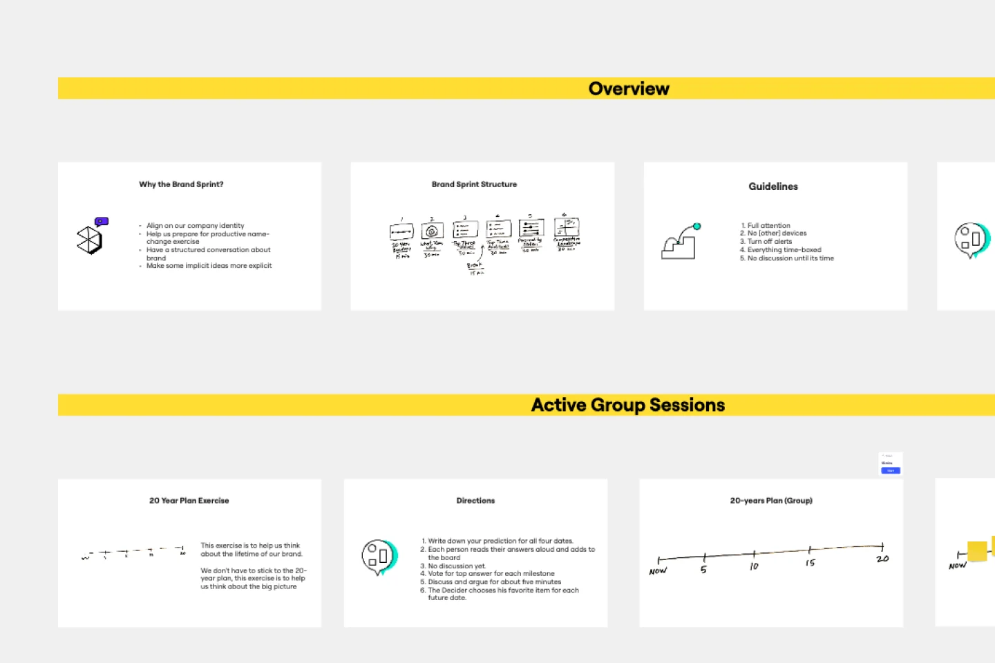
Three-Hour Brand Sprint Template
Works best for:
Marketing, Workshops, Sprint Planning
Before customers will believe in your brand, your team has to believe. That’s where brand sprints work wonders. Popularized by the team at Google Ventures, a brand sprint will help your team sort through all different ideas about your brand and align on your brand’s fundamental building blocks—your values, audience, personality, mission statement, roadmap, and more. Whether you’re building a new brand or revamping an existing one, brand sprints are ideal for trigger events such as naming your company, designing a logo, hiring an agency, or writing a manifesto.
Timeline-Retrospective
Works best for:
Timeline, Planning
Use the Timeline Retrospective template to review project progress and outcomes. It’s ideal for identifying what worked well and what didn’t, facilitating continuous improvement. This template helps teams reflect on their performance and make informed decisions for future projects.
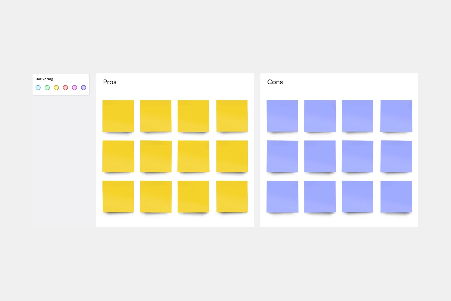
Pros and Cons List Template
Works best for:
Decision Making, Documentation, Strategic Planning
A pros and cons list is a simple but powerful decision-making tool used to help understand both sides of an argument. Pros are listed as arguments in favor of making a particular decision or action. Cons are listed arguments against it. By creating a list that details both sides of the argument, it becomes easier to visualize the potential impact of your decision. To make your pros and cons list even more objective, it can help to weight each pro and con against the others. You can then present your decision with confidence, making a strong argument for why it’s the right one.
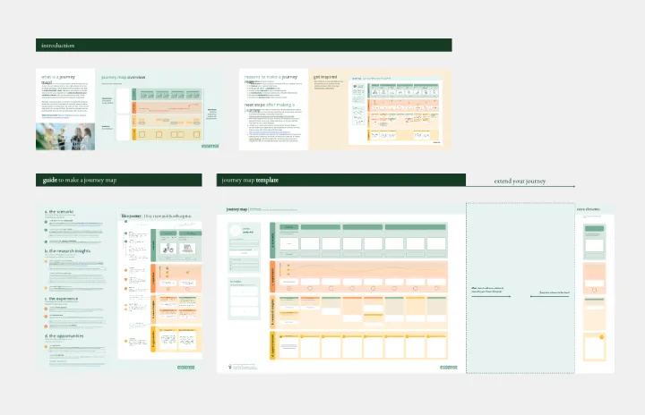
Journey Map To Plot the Customer Experience
Works best for:
Customer Journey Map
A journey is a tool to map out the customer experience of (a part of) your product/service in a visual way.
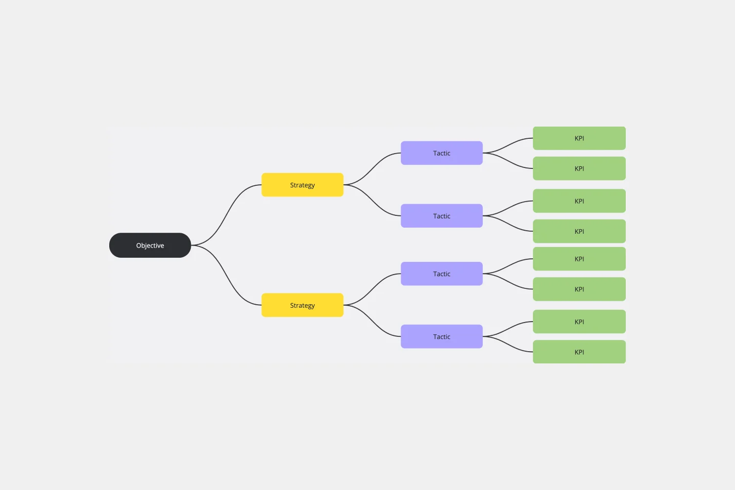
KPI Tree Template
Works best for:
Strategy & Planning
The KPI Tree Diagram is a visual tool that hierarchically illustrates an organization's objectives and breaks them down into their subsequent strategies, tactics, and measurable KPIs. By arranging these components in a tree-like structure, the diagram captures the interrelationships and dependencies between the overarching goals and the specific steps to achieve them.