Co-design Storyboard
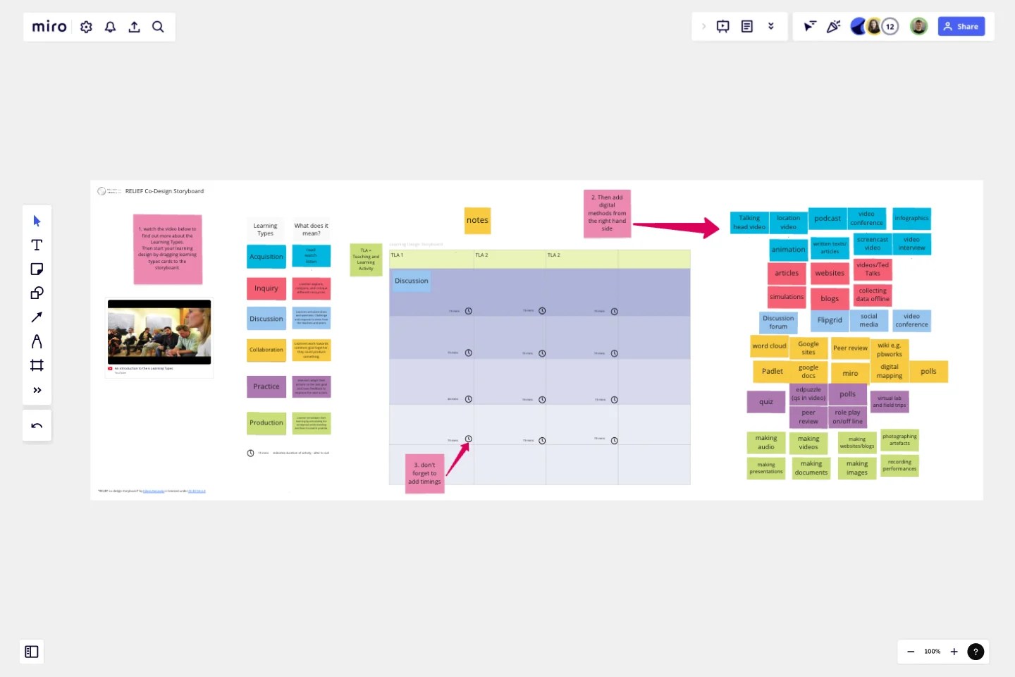
This board helps support the first stage of idea generation for co-designing online or blended courses.
The storyboard is composed of learning types cards, digital methods cards and an expandable grid featuring 3 sets of TLAs or Teaching and Learning Activities. The learning types derive from the Learning Designer tool which is based on Laurillard's Conversational Framework - a model of what it takes to teach and learn.
You can introduce a team to the six learning types using the embedded video and then work through 3 steps to create initial ideas for online or blended courses using the storyboard:
Step 1: start your learning design by dragging learning types cards to the storyboard to represent the learning experiences you want to combine to create your online/blended Teaching and Learning Activities.
Step 2: drag digital methods that correspond to the learning type (identifiable by colour) to the storyboard.
Step 3: adjust the timings (set by default at 15 minutes for each activity).
This is a light touch approach to learning design suitable for the initial ideas stage. After this stage it is recommended to transfer these initial ideas to the Learning Designer tool (learningdesigner.org) to develop the design.
This template was created by Eileen Kennedy.
Get started with this template right now.
Customer Journey Map Template
Works best for:
Ideation, Mapping, Product Management
A customer journey map (CJM) is a visual representation of your customer’s experience. It allows you to capture the path that a customer follows when they buy a product, sign up for a service, or otherwise interact with your site. Most maps include a specific persona, outlines their customer experience from beginning to end, and captures the potential emotional highs and lows of interacting with the product or service. Use this template to easily create customer journey maps for projects of all kinds.
Customer Touchpoint Map Template
Works best for:
Desk Research, Product Management, Mapping
To attract and keep loyal customers, you have to truly start to understand them—their pain point, wants, and needs. A customer touchpoint map helps you gain that understanding by visualizing the path your customers follow, from signing up for a service, to using your site, to buying your product. And because no two customers are exactly alike, a CJM lets you plot out multiple pathways through your product. Soon you’ll be able to anticipate those pathways and satisfy your customers at every step.
UX Research Repository Template
Works best for:
UX Design, User Experience
Empower your organization with customer knowledge and build a centralized research hub. From UX designers to product managers, enable everyone to get insights using the Research Repository Template.
Storyboards by maad labs
Works best for:
Storyboard, Planning, Design
Simplify your story creation process with Storyboards by maad labs. This template offers a user-friendly interface for mapping out your narrative projects, making it ideal for both beginners and seasoned professionals. It includes sections for scene descriptions, character notes, and dialogue, helping you to organize your ideas and present them clearly. Use this template to enhance your storytelling workflow and bring your creative visions to life with ease
Research Topic Brainstorm Template
Works best for:
Desk Research, Brainstorming, Ideation
Coming up with a topic for a research project can be a daunting task. Use the Research Topic Brainstorm template to take a general idea and transform it into something concrete. With the Research Topic Brainstorm template, you can compile a list of general ideas that interest you and then break them into component parts. You can then turn those parts into questions that might be the focus for a research project.
Tracking App Wireframe Template
Works best for:
Wireframe , UX, Design
Start your tracking app design project with the Tracking App Wireframe template. It offers a variety of pre-designed app screens to make building your menstrual cycle tracker wireframe fast and easy. Whether you plan to turn it into a prototype or keep it as a wireframe, this template meets all your needs.
