Kinship Diagram Template
Understand complex family relationships with a Kinship Diagram Template that keeps your relatives organized.
About the Kinship Diagram Template
Understanding how we relate to distant relatives is simple using a kinship diagram. It allows you to map out relationships without getting hung up on specific names or other pieces of information. While most commonly used by anthropologists and genealogists, a kinship diagram can be a useful tool for anyone interested in family relationships.
Keep reading to learn more about our Kinship Diagram Template.
What is a kinship diagram?
A kinship diagram is a chart outlining relationships in a family, society, or culture. In many ways, kinship diagrams are similar to family trees. But instead of listing specific names or modeling the diagram after one family, kinship diagrams are used more generally to understand how most families in a culture work.
Kinship diagram charts are most commonly used in the field of anthropology. Researchers can use kinship notation to quickly sketch social relationships as they interview subjects.
But you don’t have to be a professional anthropologist to get use out of a kinship diagram — anyone interested in family history or genealogy might find a use for it.
Benefits of a kinship diagram
Kinship diagrams are an easy way to see how family, cultural, and societal patterns play out. Often, a kinship diagram helps convey not just the family roles themselves but which relatives hold the most influence over the family.
You can also use a kinship diagram to navigate complex family roles. If you’re trying to understand third or fourth cousins, a kinship diagram can help you see where they fall in relation to you without getting hung up on specific names.
Create your own kinship diagram
You can get started on a kinship diagram very quickly. Simply open up the Kinship Diagram Template and follow the steps below:
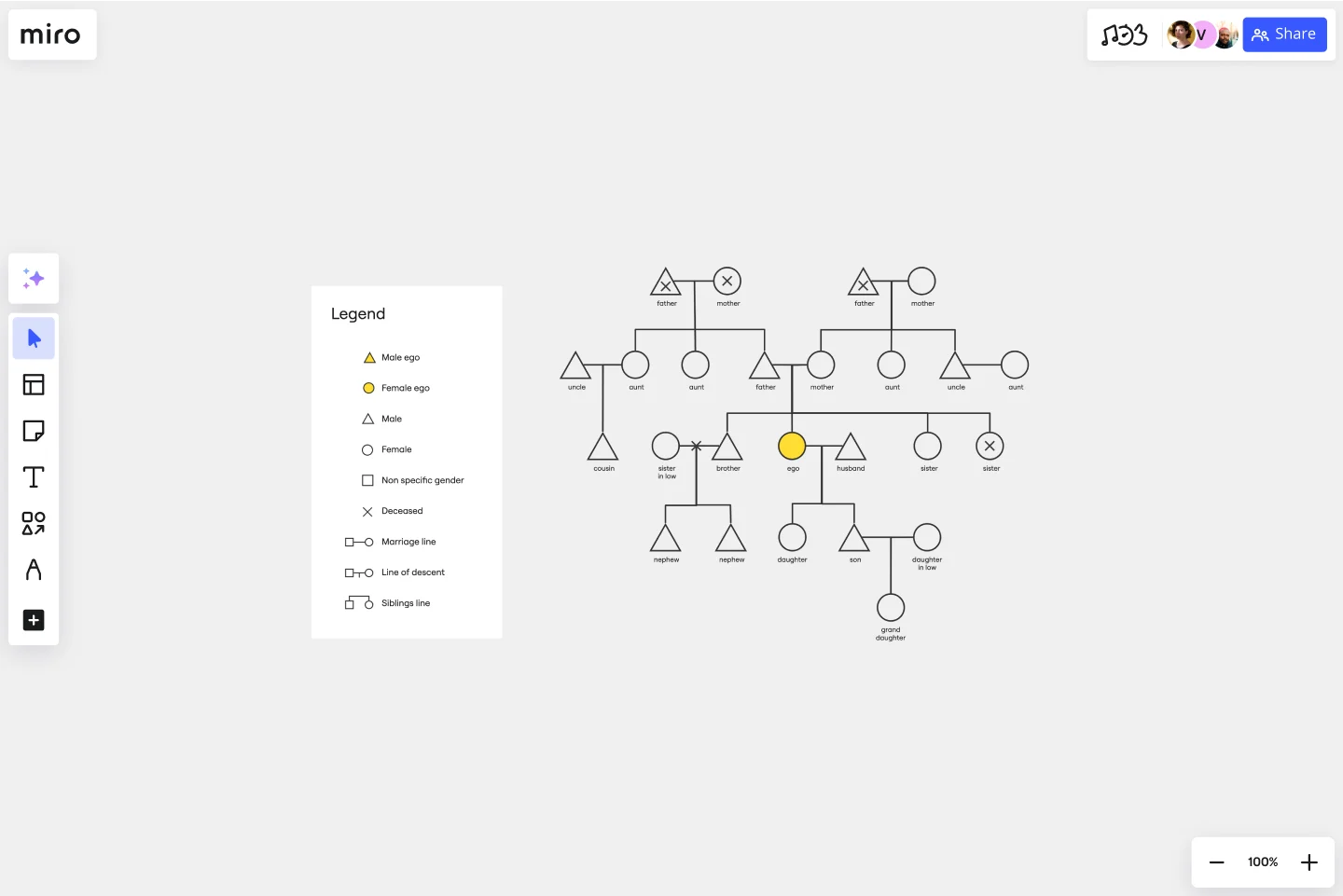
Step 1: Add “Ego,” or the starting point of your kinship diagram.
All of the relatives in the diagram will be listed in relation to Ego. When you add people to the kinship diagram, you can use the following shapes to denote gender:
Triangle: Male
Circle: Female
Square: Nonspecific gender
When you add in Ego on our Kinship Diagram Template, it will default to blue. Filling in Ego helps you find the starting point of your kinship diagram even when it’s incredibly complex.
Step 2: Build out Ego’s immediate relationships.
This can include parents, siblings, children, and partners. Be sure to use the right shapes to represent the appropriate gender for each relative.
Show connections between relatives with solid lines. A horizontal line between two people represents marriage. A vertical line descending from a marriage line represents children.
To represent siblings, draw a horizontal line at the bottom of a childline. Then, draw an additional vertical line for each sibling.
Step 3: Continue to build out the diagram using kinship notation.
Add grandparents, aunts, uncles, cousins, and more until you have a full picture of your family system.
Step 4: Mark various life events.
If you’re mapping out a real family system rather than a representative one, you can use kinship notation to mark deaths, divorces, and other life events.
Place an X over the shape for any deceased relatives. You can also use a / to note marriages that ended due to divorce or death.
Step 5: Add notes or comments to record additional information.
You can turn your kinship diagram into a family tree diagram, genogram, or pedigree chart by adding more information about life events and family relationships. If you prefer, Miro has a ready-to-use genogram template or a pedigree template that you can get started with.
If you’re working with other family members or a dedicated genealogist, you can invite them to collaborate on your kinship chart by adding their own findings. As you work together to learn more about your family system, you can easily share and edit the kinship diagram to meet your needs.
Use case for a kinship diagram
When it comes to family history research, a kinship diagram can serve as a great starting point before diving into a full-fledged family tree. Instead of getting lost in the weeds of finding your great-grandmother’s birth certificate, you can use Miro's easy family tree builder to sketch out your entire family system as you plan the best way to approach your family research.
Kinship diagrams can be used for much quicker purposes too. If you’re trying to figure out how exactly a distant relative fits into your family tree or want to know the precise term for that relation, a kinship diagram provides an easy visual to help you find the answer.
Who can use a Kinship Diagram Template?
If you’re interested in understanding a family or social relationship in any context, then you can use the Kinship Diagram Template. Because kinship diagram charts are simplified and standardized, they are a great way to dip your toes into genealogy and family research. You can get a handle on how people are related to each other before diving into public records and family documents.
What is kinship notation?
Kinship notation is a system of symbols that anthropologists and genealogists use to map our family and social structures. In kinship notation, shapes represent gender — triangle for male, circle for female, and square for nonspecific — and lines represent immediate relationships. In kinship notation, you can also use X or / to indicate deaths or broken relationships.
What’s the difference between a family tree and a kinship diagram?
A kinship diagram maps out broad family and social structures as they most commonly exist in a culture. A family tree is a specific, personal history of one family that includes information about births, deaths, marriages, and other life events.
Get started with this template right now.
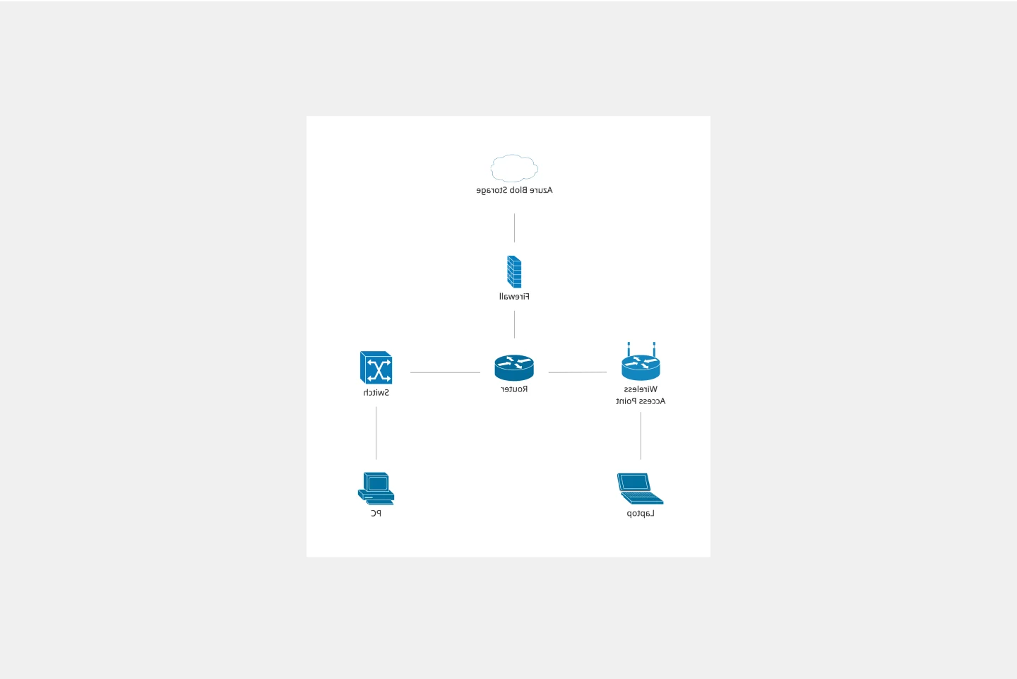
Cisco Network Diagram Template
Works best for:
Software Development, Diagrams
Cisco offers data center and access networking solutions built for scale with industry-leading automation, programmability, and real-time visibility. The Cisco Data Network Diagram uses Cisco elements to show the network design of Cisco Data Networks visually.
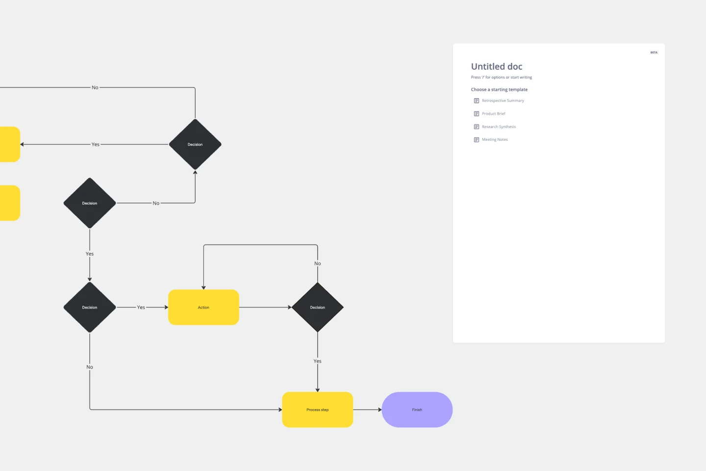
Flow Diagrams
Works best for:
Diagramming
The Flow Diagrams template offers a versatile tool for visualizing processes, workflows, and systems. It provides a range of shapes and connectors for creating flowcharts, process maps, and data flow diagrams. This template enables teams to represent complex systems and processes in a clear and structured manner, facilitating communication and decision-making. By promoting visual clarity and understanding, Flow Diagrams empower teams to analyze and optimize processes effectively, driving efficiency and productivity.
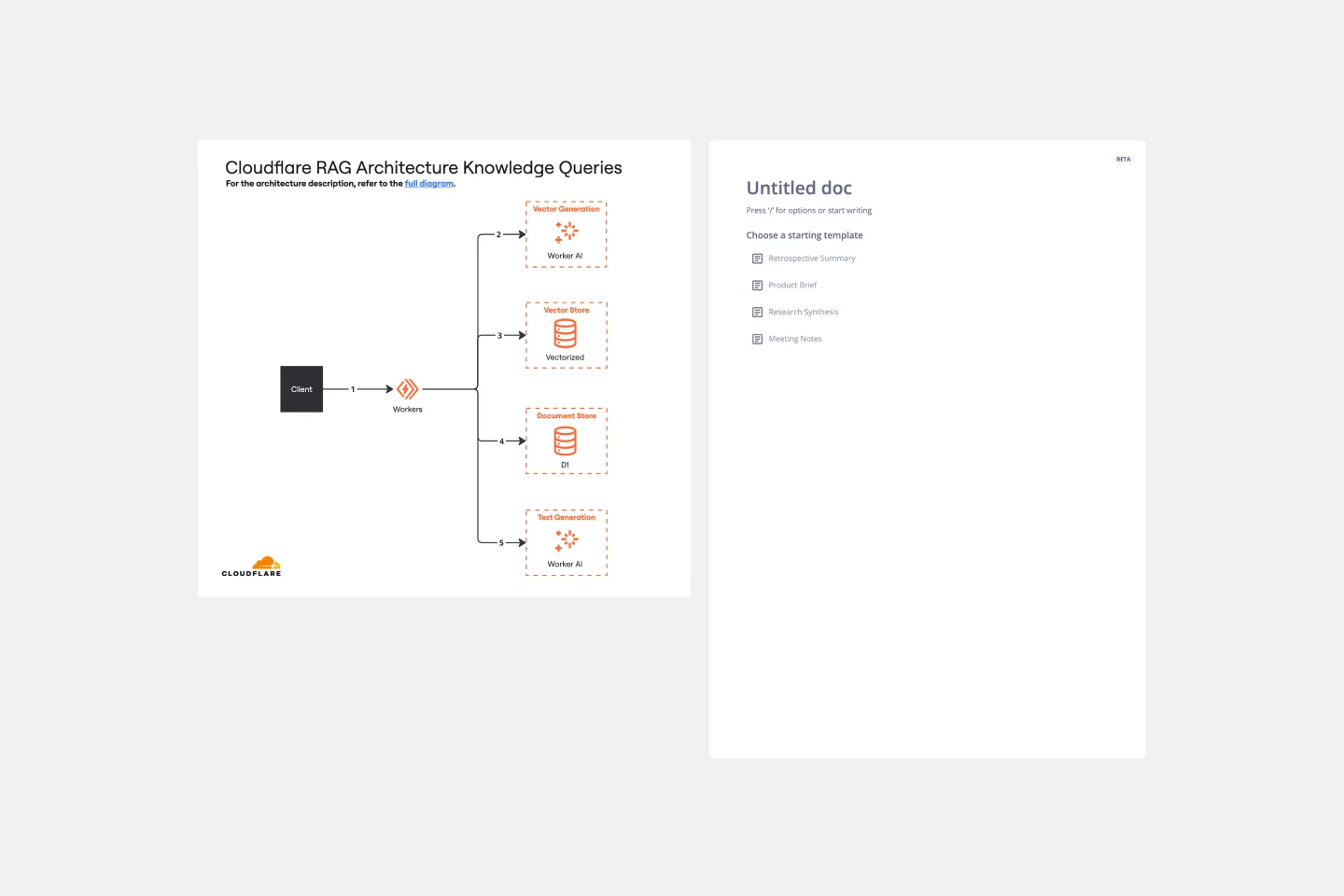
Cloudflare RAG Architecture Knowledge Queries Template
The Cloudflare RAG Architecture Knowledge Queries template is a cutting-edge tool designed to streamline the process of diagramming and understanding the intricate architecture of Cloudflare's Retrieval Augmented Generation (RAG) system. This template is a boon for teams aiming to visualize, query, and optimize Cloudflare's infrastructure collaboratively.
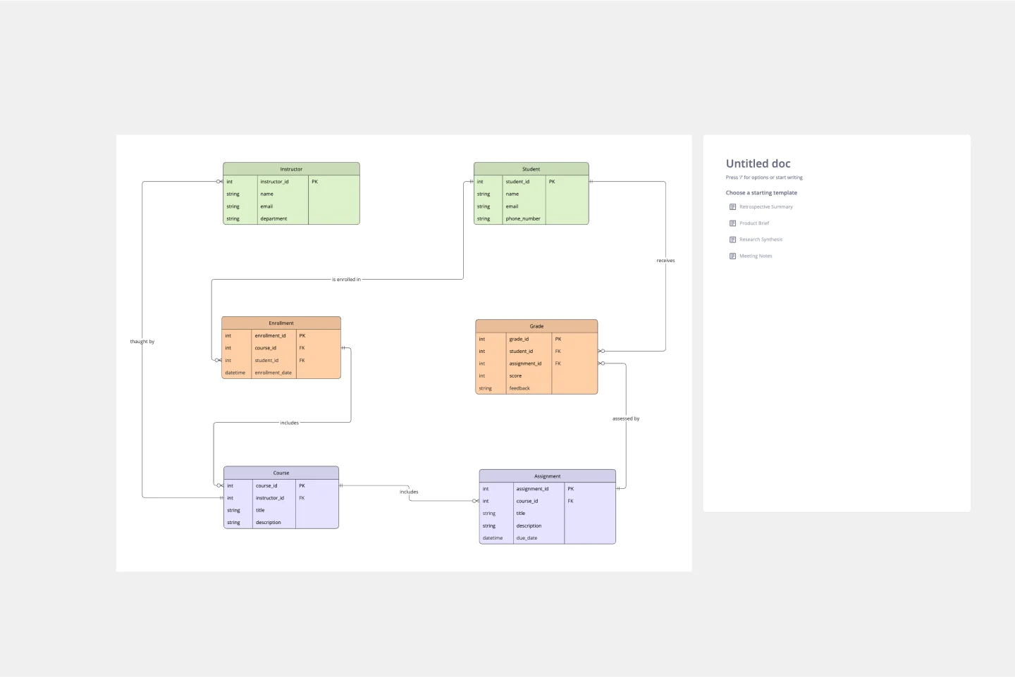
ERD Educational Learning Management System Template
Works best for:
ERD
The ERD Educational Learning Management System Template is designed to streamline the management and organization of educational systems, particularly useful for institutions adapting to online and hybrid learning environments. It helps in efficiently planning and implementing Learning Management System (LMS) features by identifying key entities such as Students, Courses, Instructors, Assignments, and Grades, and the relationships between them.
Affinity Diagram by UserPeek
Works best for:
Diagramming
The Affinity Diagram template is a visual tool for organizing and categorizing ideas, data, or issues into related groups. It provides a structured framework for conducting group brainstorming and affinity grouping activities. This template enables teams to synthesize information, identify patterns, and generate insights collaboratively. By promoting creativity and collaboration, the Affinity Diagram empowers teams to organize and prioritize information effectively, driving decision-making and problem-solving processes efficiently.
Production Flowchart Template
Works best for:
Flowcharts
The Production Flowchart Template is a well-crafted tool that clearly represents a production process from start to finish. It breaks down complex procedures into easy-to-understand segments, making it easier for stakeholders to grasp the entire process. One of the key benefits of using this template is that it helps to clarify complex production pathways. By mapping out operations visually, teams can identify potential bottlenecks or inefficiencies, facilitating timely and well-informed decision-making.