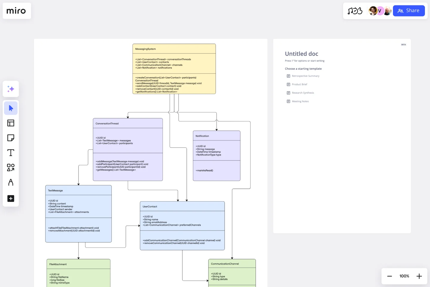
UML Class Messaging System Template
Provide a structured visual framework that simplifies the complexity of messaging systems with the UML Class Messaging System Template.
Available on Enterprise, Business, Education plans.
About the UML Class Messaging System Template
The UML Class Messaging System Template is designed to fully visualize a messaging system's functionality. This template helps in managing various aspects of a messaging system, including text messages, conversation threads, user contacts, notifications, and channels. It provides a clear visual representation of how all these elements interact within the system, making it an invaluable tool for system designers and developers aiming to understand or convey the structure and dynamics of messaging systems.
How to use the UML Class Messaging System Template
Edit the template: After adding the template to your board, you can start customizing it to fit your specific project needs. You can modify the classes, attributes, methods, and relationships to accurately represent the messaging system you are designing or analyzing.
Collaboration: Invite your team to collaborate on the diagram in real-time or asynchronously. Discuss, edit, and refine the diagram together, ensuring a comprehensive understanding and agreement on the system's design.
Review and iterate: Use Miro's commenting to gather input from stakeholders or team members. Iterate on the design as needed based on the feedback received to ensure the final diagram accurately represents the intended messaging system architecture.
Why use the UML Class Messaging System Template
Using the UML Class Messaging System template in Miro has several advantages:
Efficiency: Quickly get started with a structured visual representation, saving time on initial setup.
Clarity: Provides a clear and detailed overview of the messaging system's architecture, making it easier to identify potential issues or improvements.
Collaboration: Facilitates effective team collaboration and stakeholder engagement, ensuring all voices are heard and considered in the design process.
Flexibility: Easily customizable to fit the unique requirements of your project. Whether you're designing a simple messaging app or a complex communication platform, the template can be adapted to suit your needs.
Visual clarity: The template provides a visual framework that simplifies the understanding of complex messaging systems. By mapping out classes, attributes, methods, and relationships, stakeholders can easily grasp how different components interact.
Improved communication: It serves as a common language for developers, designers, and stakeholders, facilitating clearer communication. The visual representation helps in bridging the gap between technical and non-technical team members, ensuring everyone is aligned.
Error reduction: Early visualization of the system architecture can help identify potential issues or inefficiencies, reducing errors in the development phase. This proactive approach saves time and resources in the long run.
Documentation and reference: The completed diagram can serve as valuable documentation for current and future development efforts. It provides a reference point for understanding the system's structure and can be used to onboard new team members or guide future expansions.
Get started with this template right now. Available on Enterprise, Business, Education plans.
Social Media Strategy Planning
Works best for:
Roadmap, Planning, Mapping
The Social Media Strategy Planning template provides a structured approach for developing and implementing social media strategies. By defining objectives, target audiences, and content plans, teams can maximize the impact of their social media efforts. This template fosters collaboration and alignment across teams, ensuring that social media initiatives are integrated with broader marketing goals and contribute to overall business objectives.
Miro for AWS Well-Architected Framework Reviews
Works best for:
Diagramming, AWS
This AWS Well-Architected Framework Review (WAFR) template provides you and your team with a dedicated space to conduct a Well-Architected Framework Review with a client.
Product Vision Statement
Works best for:
Product Management, Planning
The Product Vision Statement template helps product teams articulate clear and inspiring visions for product development. By defining long-term goals, market aspirations, and customer value propositions, this template aligns teams around a shared vision for success. With sections for outlining strategic objectives, guiding principles, and success metrics, it provides clarity and direction for product development efforts. This template serves as a compass for product teams, guiding them towards meaningful outcomes and driving innovation and growth.
UML Component Diagram Template
Works best for:
Mapping, Diagrams, Software Development
Use our Component Diagram template to show how a system’s physical components are organized and wired together. Visualize implementation details, make sure planned development matches system needs, and more — all in a collaborative environment.
Roadmap Mountain
Works best for:
Roadmap, Planning, Mapping
The Roadmap Mountain template provides a metaphorical framework for planning and visualizing project objectives and milestones. By depicting the journey towards achieving goals as a mountain ascent, teams can inspire motivation and focus. This template encourages collaborative goal-setting and fosters a sense of accomplishment as teams progress towards their summit. With clear milestones in sight, teams can stay motivated and track their progress effectively.
Cisco Data Network Diagram Template
Works best for:
Software Development
Cisco offers data center and access networking solutions built for scale with industry-leading automation, programmability, and real-time visibility. The Cisco Data Network Diagram uses Cisco elements to show the network design of Cisco Data Networks visually.
