Wardley Mapping Canvas Template
Build an intuitive understanding of your business context.
About the Wardley Map template
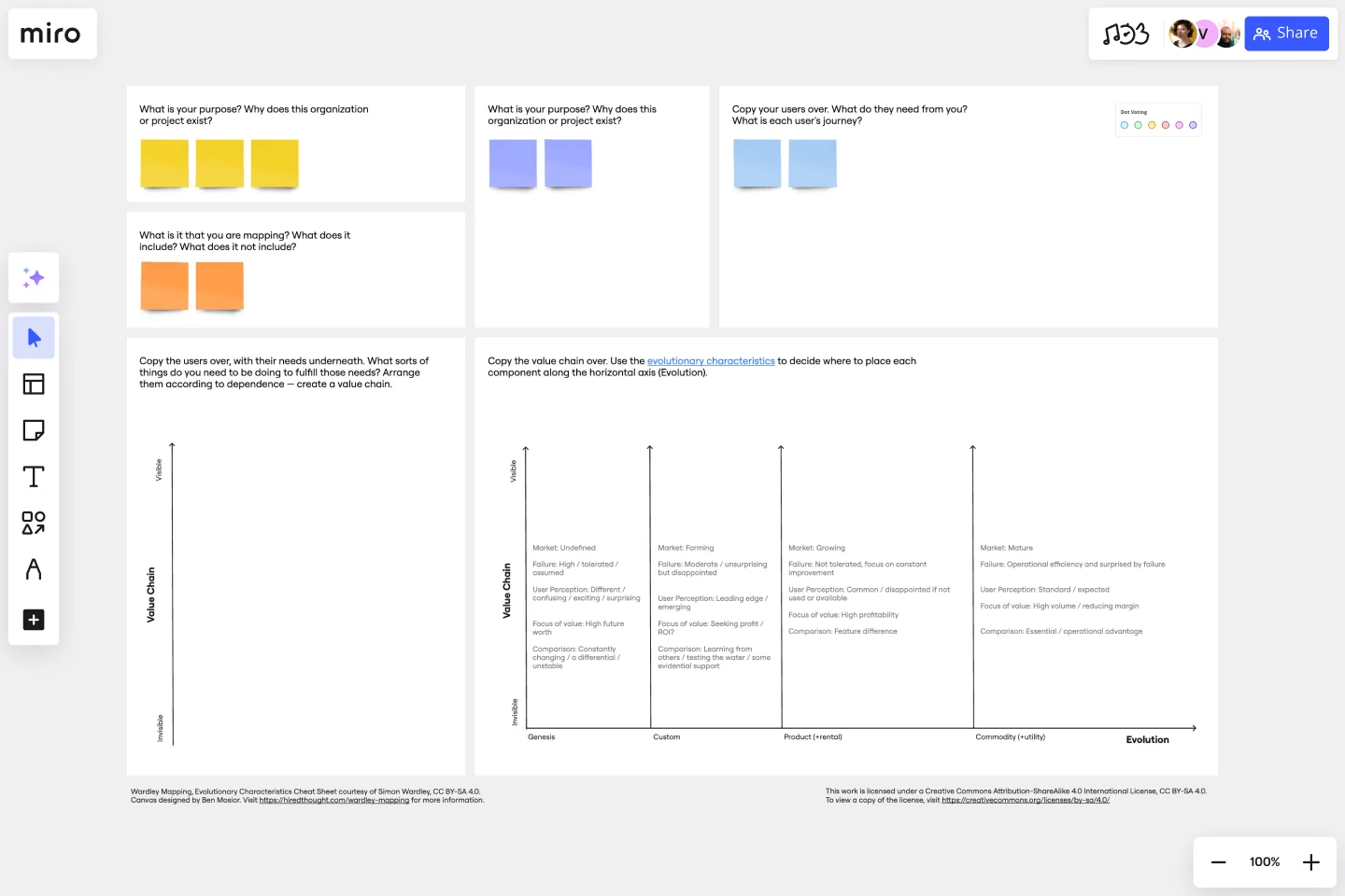
What is a Wardley Map?
A Wardley Map was developed to map the structure of a business, understand its context, and better serve users. You place components with value on the y-axis and commodity on the x-axis.
Every organization operates within a landscape that contextualizes and influences your decisions. To build a Wardley Map, you must illustrate that landscape as a value chain. What’s a value chain? It’s a series of activities or elements that are required to meet a user’s needs. You categorize each element of the value chain according to their stage of evolution compared to the competition. The resulting Wardley Map describes your assumptions and intentions for anyone to read.
The goal of Wardley mapping is to build a shareable, scalable visualization of the landscape surrounding your business. It allows you to articulate your strategy while summarizing the landscape in a way that’s easy to understand. A Wardley Map is like a time capsule, capturing your understanding at a certain point in time and documenting it for the future.
Why use a Wardley Map?
Use a Wardley map to assess future scenarios, quickly validate solutions, and develop a shared visual understanding of a business' context. Using a Wardley Map, you can significantly reduce a project's risk and avoid costly mistakes.
The benefits of using a Wardley Map
Benefit 1 - Enhance communication. Easily communicate your understanding of the landscape to your team, new hires, and stakeholders. Wardley Maps are powerful tools that can help get new employees up to speed quickly, so they can hit the ground running on day one.
Benefit 2 - Identify risks and opportunities. A Wardley Map clearly lays out the environment in which your product is operating, as well as the value chain that constrains it. This allows you to understand the challenges ahead and how can exploit market gaps.
Benefit 3 - Reduce costs. Wardley Maps help ensure everyone on your team is aligned, and that cross-functional partners share your understanding of the landscape. This alignment reduces costly errors and streamlines your processes.
Benefit 4 - Foster collaboration. Wardley mapping empowers you to minimize risk and conflict across your teams. Teams that engage in Wardley mapping report higher satisfaction, deeper understanding, and closer alignment on shared goals.
Get started with this template right now.
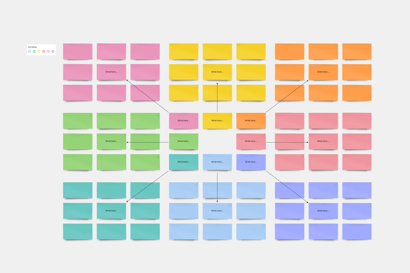
Mandala Chart Template
Works best for:
Planning, Brainstorming, Goal setting
The Mandala Chart Template helps you visualize the relationships between a central theme and its sub-themes. One of the key benefits is how it fosters a holistic understanding of any topic. This perspective ensures every detail is noticed, making it an invaluable asset for those aiming for comprehensive insight and thorough planning or a better understanding of their goals.
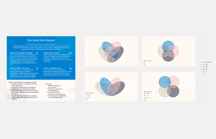
Four-Circle Venn Diagram by Irfan Rosli
Works best for:
Venn Diagrams
The Four Circle Venn Diagram template offers a robust tool for detailed data comparison involving four sets. Use it to identify common and unique attributes across multiple categories. This template is perfect for complex analysis in research, strategic planning, and education. It helps visualize relationships clearly, making it easier to draw insights and communicate findings. Ideal for professionals and educators needing advanced comparative tools.
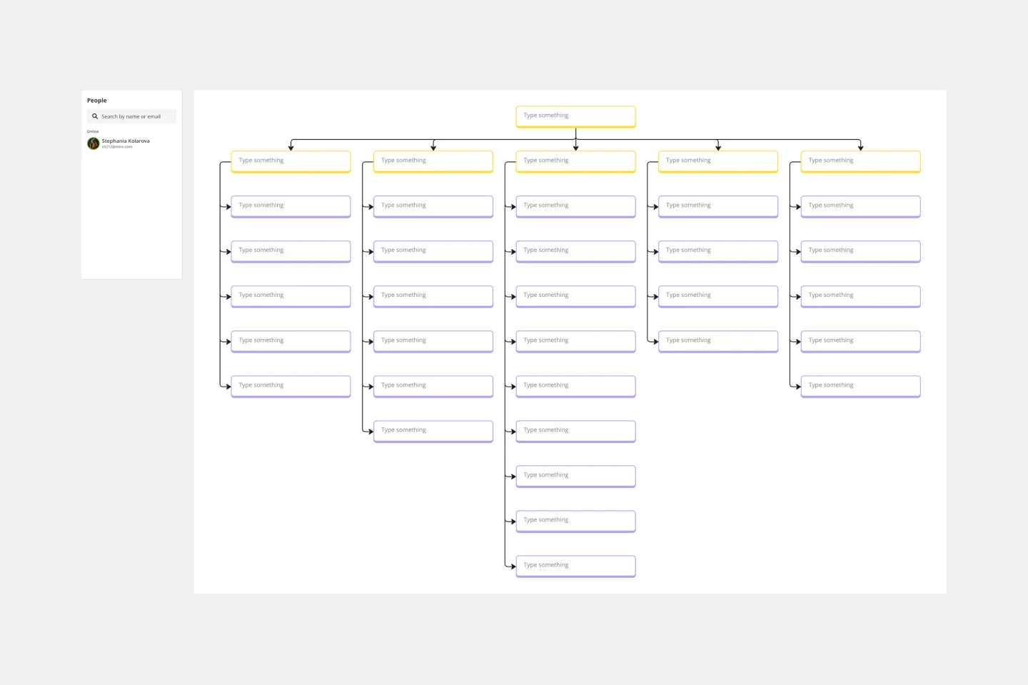
Work Breakdown Structure Template
Works best for:
Project Management, Mapping, Workflows
A work breakdown is a project management tool that lays out everything you must accomplish to complete a project. It organizes these tasks into multiple levels and displays each element graphically. Creating a work breakdown is a deliverable-based approach, meaning you’ll end up with a detailed project plan of the deliverables you must create to finish the job. Create a Work Breakdown Structure when you need to deconstruct your team's work into smaller, well-defined elements to make it more manageable.
Features Audit Template
Works best for:
Desk Research, Product Management, User Experience
Add new features or improve existing features—those are the two paths toward improving a product. But which should you take? A features audit will help you decide. This easy, powerful product management tool will give you a way to examine all of your features, then gather research and have detailed discussions about the ones that simply aren’t working. Then you can decide if you should increase those features’ visibility or the frequency with which it’s used—or if you should remove it altogether.
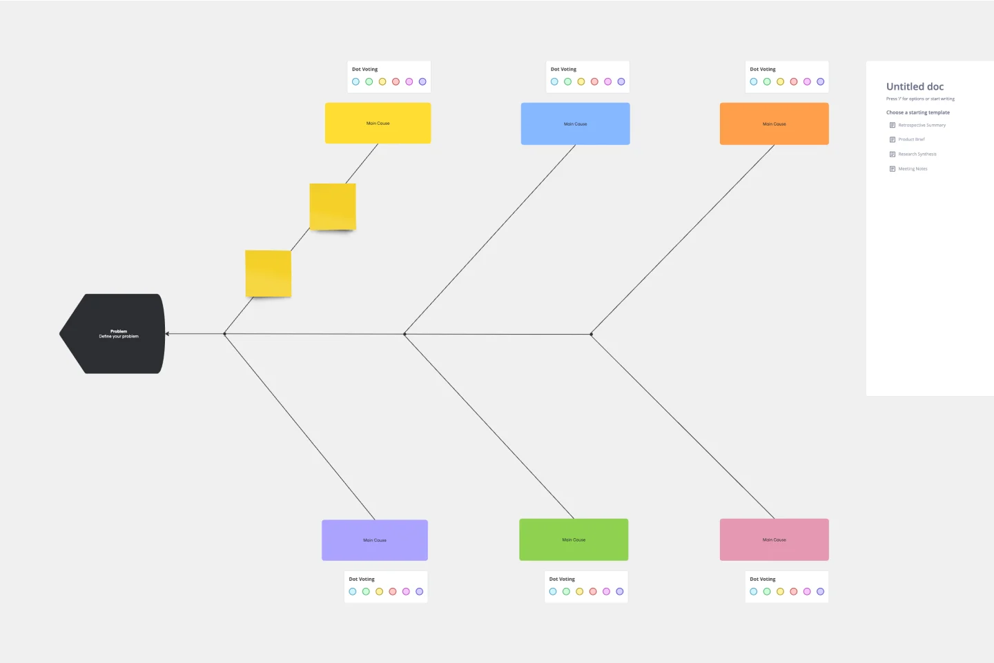
Fishbone Diagram Template
Works best for:
Operations, Diagrams, Workflows
What is the best way to solve any problem your team faces? Go straight to the root. That means identifying the root causes of the problem, and fishbone diagrams are designed to help you do it best. Also known as the Ishikawa Diagram (named after Japanese quality control expert Kaoru Ishikawa), fishbone diagrams allow teams to visualize all possible causes of a problem, to explore and understand how they fit together holistically. Teams can also use fishbone diagrams as a starting point for thinking about what the root cause of a future problem might be.
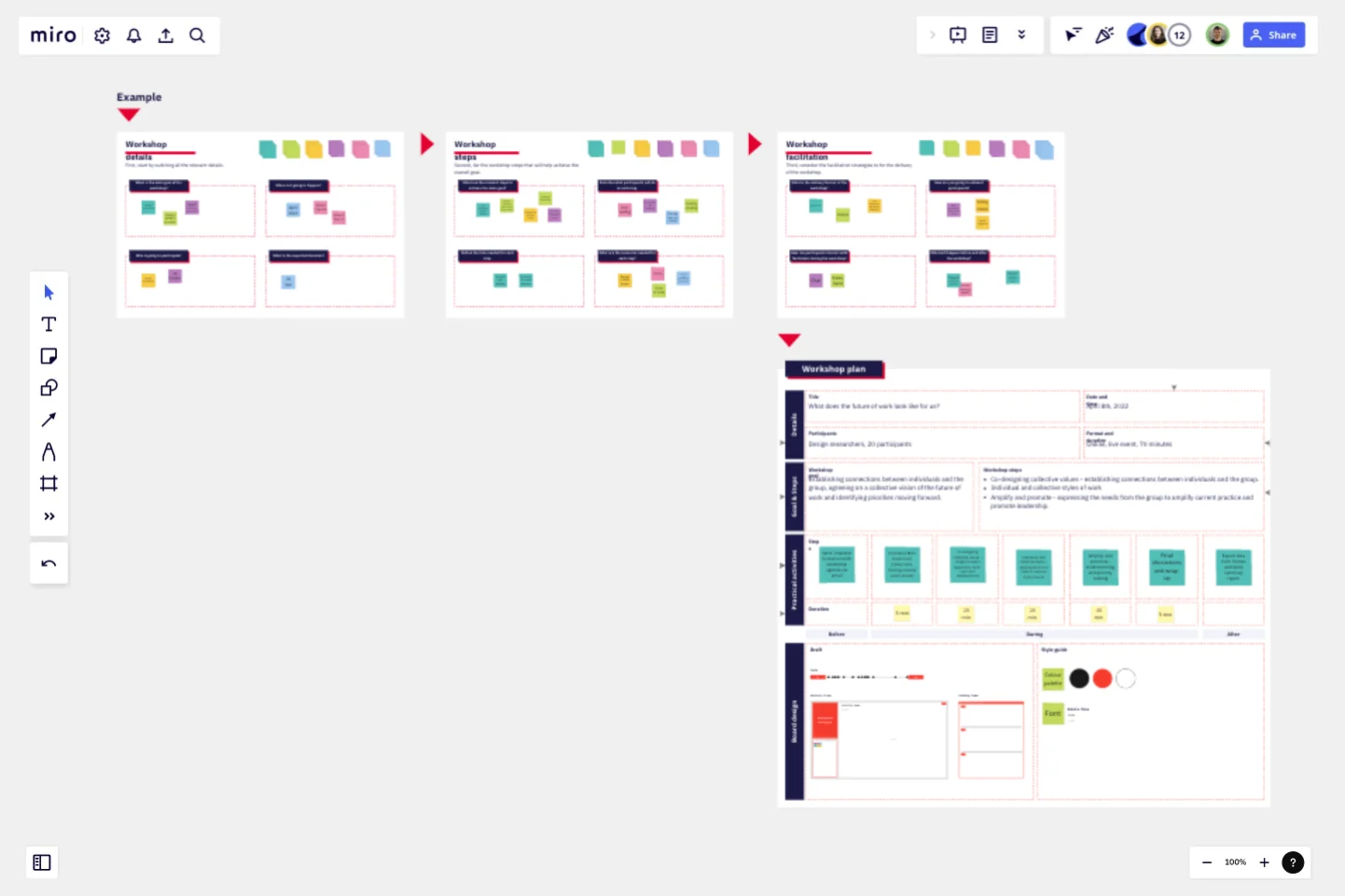
Workshop Planner
Works best for:
Planning, Strategy
Workshop Planner template helps you organize and plan effective workshops. It allows you to outline activities, set timelines, and allocate resources, ensuring your workshops run smoothly and achieve their objectives.